How to combine Scandinavian interior design with color in the home?
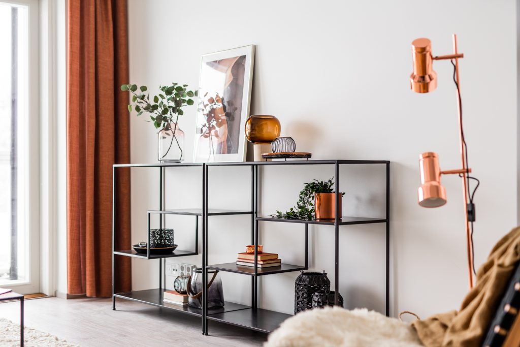
Combining Scandinavian interior design with color creates a perfect balance of Nordic minimalism and personal expression. Traditional Scandinavian design embraces simplicity, natural materials, and neutral tones, but incorporating thoughtful color accents can transform these spaces without sacrificing their essence. The key is selecting complementary hues that enhance rather than overwhelm the clean aesthetic, introducing them through textiles, artwork, or statement furniture while maintaining the bright, airy feeling that defines Nordic interiors. This balanced approach creates homes that honor Scandinavian design principles while reflecting individual personality and warmth.
Understanding Scandinavian interior design principles
Scandinavian interior design originated in the Nordic countries (Denmark, Finland, Iceland, Norway, and Sweden) during the early 20th century. It emphasizes functional minimalism, where every element serves a purpose while contributing to an overall aesthetic of calm simplicity.
The core principles of Scandinavian design include:
- Clean lines and uncluttered spaces that promote tranquility
- Maximizing natural light to counter long, dark Nordic winters
- Functional furniture with simple, organic forms
- Natural materials including wood, wool, linen, and leather
- Neutral color foundations that amplify brightness
This design approach reflects Nordic cultural values of practicality, durability, and connection to nature. Finnish interior design, in particular, emphasizes these elements while incorporating local traditions and materials. When exploring different interior styles and combinations, understanding these foundational principles helps maintain authenticity while introducing personalized color elements.
Scandinavian interiors traditionally feature white walls and pale woods to maximize light reflection during dark winters. This creates the perfect neutral canvas for thoughtful color integration, allowing even small color additions to make significant impact without overwhelming the space’s inherent serenity.
What colors work best with Scandinavian interior design?
The most effective colors for Scandinavian interiors complement rather than compete with the design’s inherent brightness and natural elements. Traditional Nordic color palettes revolve around soft, muted tones that echo the regional landscape.
Colors that harmonize beautifully with Scandinavian design include:
- Pale blues and seafoam greens reminiscent of Nordic fjords
- Dusty pinks and muted terracottas that add warmth without heaviness
- Soft greys that enhance the sense of calm
- Deeper blues and forest greens for dramatic accents
- Black as a grounding element (used sparingly)
| Color Category | Examples | Best Used For |
|---|---|---|
| Neutrals (Foundation) | White, cream, beige, light grey | Walls, large furniture pieces, flooring |
| Soft Naturals | Sage green, powder blue, blush pink | Secondary furniture, textiles, accent walls |
| Bold Accents | Mustard yellow, teal, burnt orange | Cushions, artwork, small accessories |
| Grounding Elements | Charcoal, navy, forest green | Statement pieces, textiles, small doses |
At Avain Asunnot, we’ve developed three distinctive styles that embrace these color principles while offering different interpretations of Scandinavian design. Our Vilja style features soft beige tones with marble accents, creating a trend-conscious but timeless aesthetic. The Kallio style introduces concrete greys and black for a more modern, edgy take, while our Hanki collection embodies the classic white-based Nordic palette with subtle beige accents.
These carefully curated palettes complement the classic Scandinavian foundation while allowing for personal expression through our homeownership options and interior choices. Adding Tikkurila’s seven enhancement colors can further personalize these spaces with soft, contemporary hues.
How can you add color without overwhelming Scandinavian minimalism?
Introducing color to Scandinavian interiors requires a thoughtful, layered approach that maintains the design’s inherent simplicity. The goal is to enhance rather than disrupt the minimalist aesthetic that defines Nordic spaces.
Effective strategies for incorporating color include:
- The 60-30-10 rule: 60% neutral base, 30% secondary color, 10% accent color
- Focusing on textiles for non-permanent color (cushions, throws, rugs)
- Using natural materials with inherent color variations (terracotta, leather, copper)
- Introducing color through art and decorative objects
- Emphasizing texture alongside color for dimension
One particularly effective approach is creating a single statement piece in a bolder color—perhaps a sofa in dusty blue or dining chairs in pale blush—while keeping surrounding elements neutral. This creates a focal point without overwhelming the space’s inherent serenity.
Plants offer another natural way to introduce color while reinforcing the connection to nature that’s fundamental to Scandinavian design. Trailing plants or structured succulents bring living color that complements the Nordic aesthetic.
When looking to add color to your Scandinavian-inspired home, consider how our three carefully designed styles can serve as your foundation. Whether you prefer the classic white palette of Hanki, the warm beige tones of Vilja, or the modern contrast of Kallio, each provides a thoughtfully designed base for personal color expressions. Browse our available homes to find the perfect canvas for your colorful Nordic vision.
Which rooms benefit most from colorful Scandinavian design?
While Scandinavian color principles can be applied throughout the home, certain spaces particularly thrive with strategic color additions. The living room and bedroom often benefit most from thoughtful color integration, creating warmth in the spaces where comfort is paramount.
Room-by-room color considerations include:
- Living rooms: Perfect for statement furniture in muted colors, textured rugs, and art that introduces personality
- Kitchens: Cabinet colors (like Avain Asunnot’s beige Vilja or concrete-grey Kallio options) create character while colorful ceramics add visual interest
- Bedrooms: Textile-focused color through duvets, throws, and pillows creates warmth without sacrificing restfulness
- Children’s rooms: More playful color is appropriate while maintaining Nordic simplicity through natural materials and organized storage
- Bathrooms: Subtle color through tiles (like our Hanki style’s gentle grey floor tiles) maintains tranquility while adding interest
| Room | Traditional Approach | Modern Colorful Interpretation |
|---|---|---|
| Living Room | White walls, pale wood, neutral sofa | White walls, dusty blue sofa, mustard cushions, natural wood |
| Kitchen | White cabinets, wooden countertops | Beige or grey cabinets (like Vilja or Kallio styles), wooden elements, colored ceramics |
| Bedroom | All-white with natural textures | White base with blush or sage bedding, natural wood furniture |
| Bathroom | White tiles, minimal decor | White with accent tiles (like Kallio’s Carrara marble-look tiles), colored textiles |
The entryway presents another opportunity for color expression, creating an immediate impression of your home’s personality. A colorful bench or hooks against white walls exemplifies how Scandinavian design can embrace color while maintaining its signature simplicity.
Our Avain Asunnot designs consider these room-specific approaches. For instance, the Vilja style introduces warm beige tones in the kitchen and bathroom, creating spaces that feel both trendy and timeless. The Kallio style brings concrete grey to kitchens with dramatic black countertops for a more contemporary Nordic interpretation. Each serves as a thoughtful foundation for your personal color expressions.
How do seasons affect color choices in Nordic design?
Seasonal shifts profoundly influence color choices in Scandinavian interiors, reflecting the dramatic changes in natural light throughout the Nordic year. This seasonal adaptability is a defining characteristic of Finnish and broader Scandinavian design philosophy.
Typical seasonal color approaches include:
- Winter: Warmer neutrals, deeper blues, and textural elements that create coziness during dark months
- Spring: Introduction of soft pastels and fresher greens that echo the returning light
- Summer: Brighter blues, botanical greens, and perhaps more vibrant accents that celebrate the midnight sun
- Autumn: Earthy tones including rust, amber, and forest green that reflect the changing landscape
Textiles provide the most flexible way to adapt to these seasonal shifts. Heavier, darker textiles in winter give way to lighter, brighter options in summer. Similarly, candlelight and warm-toned lighting becomes essential during darker months, while summer calls for minimal artificial lighting.
This seasonal approach doesn’t require complete redecoration. Instead, it might involve rotating cushion covers, throws, and smaller decorative elements. A neutral Scandinavian foundation, like those found in our Hanki collection’s white cabinets and pale wooden floors, provides the perfect canvas for these seasonal adjustments.
The connection between interior and exterior remains vital year-round in Nordic design. In summer, bringing in fresh flowers and opening spaces to natural light enhances this relationship, while winter calls for evergreen elements and warm lighting that creates refuge from the darkness.
Key takeaways for creating a colorful yet balanced Scandinavian home
Successfully combining Scandinavian design with color requires thoughtful balance and intention. The essence lies in understanding that color should enhance rather than dominate the serene foundation that makes Nordic interiors so appealing.
Essential principles for colorful Scandinavian homes include:
- Starting with an authentic Nordic base of clean lines, natural materials, and functional simplicity
- Choosing a cohesive color palette inspired by nature and Nordic landscapes
- Introducing color gradually through layered elements rather than bold wall colors
- Maintaining breathing space and avoiding clutter, regardless of color choices
- Respecting the importance of natural light by keeping window treatments minimal
Remember that authentic Scandinavian design is deeply personal rather than prescriptive. While minimalism provides the foundation, your home should reflect your personality through thoughtfully chosen colors and meaningful objects—a principle we embrace in our Avain Asunnot designs with their distinct personalities.
The Finnish approach to home design particularly values this balance of functionality, beauty, and personal expression. By starting with a well-designed foundation like our Vilja, Kallio, or Hanki collections, you create the perfect canvas for introducing your unique color preferences while maintaining the timeless elegance of Nordic design.
When considering how to bring color into your Scandinavian-inspired space, remember that quality trumps quantity. A few carefully selected colored elements in superior materials will create more impact than numerous less considered pieces. This philosophy of intentional selection reflects the broader Nordic value of conscious consumption and enduring design.
Ultimately, a colorful Scandinavian home should feel both timeless and personal—a space that honors design traditions while expressing your individual story through thoughtful color choices and meaningful objects. This balance creates spaces that remain relevant and restorative regardless of changing trends.